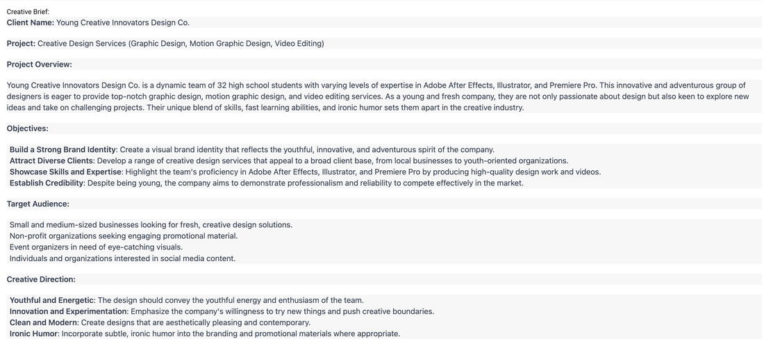
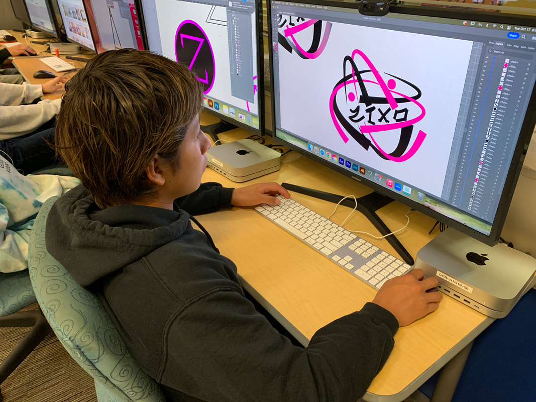
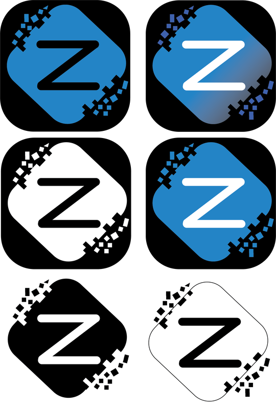
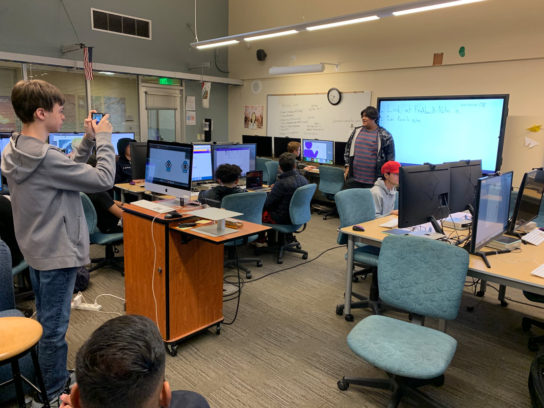
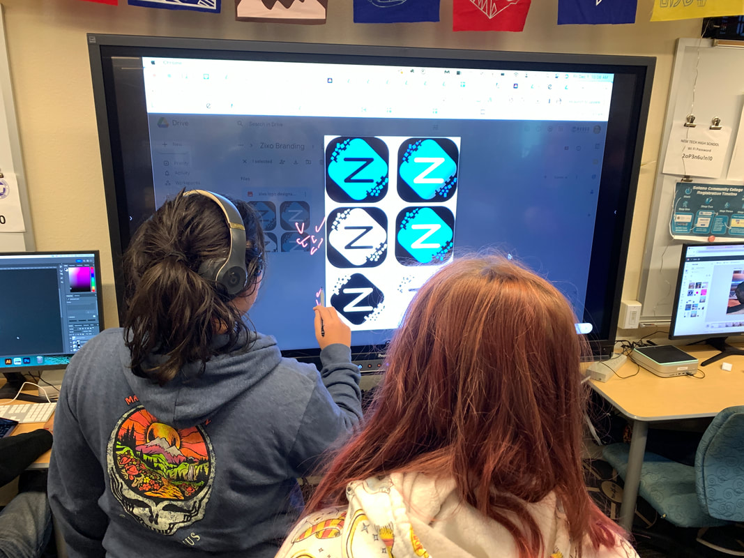
Background: The Zixo logo we inherited The Zixo logo we inherited About 10 years ago, the current Graphic Design teacher established an enterprise class of students who did Graphic Design work and got paid for their services. All the funds went toward purchase of materials and equipment for the classroom. Since I inherited the Graphic Design Department, I have long wondered if we could bring back the enterprise function and instead of purchasing classroom equipment, give the money back to the students who did the actual work when the school year ended. Could we create a college scholarship fund that would help students in their next steps toward college and career after they left New Tech High School? Because the class had already set up the bank accounts and the name of the company, Zixo Designs, we decided as a Skills USA chapter, to simply revive the bank account and the brand. We needed to rethink our logo, our overall brand and the services that we would offer the community. The most logical place to start for us was with the logo, so we decided as a chapter that each student would design a logo for the business and then we'd choose together which one we wanted to represent Zixo. It became a great way to model what students would need to do in the future when they managed to land real paying clients! ProcessFollowing the industry process for logo creation, the first step was to write up a creative brief together. For this, we had a discussion about who we were, who we wanted to serve, what our unique offer would be, who are competition might be, and how we would differentiate ourselves. We realized that no-one else in the local business world would be offering what we could offer, a chance to get inexpensive design work done while working with a group of young and vibrant designers.  After we filled out our client questionnaire with all the key facts, we plugged all of the information into ChatGPT together and asked it to formulate our Creative Brief. We talked about when and where AI is useful and how to use it ethically in the design world. We even spent a week watching videos from the Adobe Education Exchange about the ethical considerations of using AI in the field. Ideation and IterationThe Creative Brief became our touchstone document for working on the first round of sketches. Each chapter member presented their conceptual sketches to the rest of the members for feedback and considerations for next steps. Students then began the first drafts of their logos in Adobe Illustrator and Fresco. We then went through another round of feedback and peer review so that students could further refine their logos. In the end, we voted on the final logo and chose the one we wanted to use moving forward. The student whose work we chose then completed several iterations of the logo for use on the website, stickers and T-shirts, social media and brochures. We needed a version that would work on both light and dark backgrounds as is true for most clients in the real world. OrganizationIn this process, we "hired" team members through the process of resume writing and interviewing in front of the whole group. We hired team leaders, creative directors, project managers and Junior or Senior Designers. Throughout this process, the team leaders were responsible for running regular stand-up scrum meetings, checking with the CEO (me) if there were any obstacles or issues that needed to be discussed, and generally keeping the process moving forward. The entire enterprise was effectively student-led through a clear delineation of roles, responsibilities and systems. Any systems needed for file sharing or for creating collaborative folders were established by the Operations folks. The Ops department also took any and all notes during feedback sessions and shared them to the group so they could act upon those notes. Any announcements or decisions that needed to be made were done by the students and most decisions were made as one big team. Set up for Future SuccessGoing through the design process internally first, modeled for students how to move through the various stages of design and implementation. This became critical for students to understand, because we got our first paying logo design client soon after! From there, the students took over the entire process, from doing the intake interview with the client, to writing up the creative brief, to conducting internal feedback sessions, prior to meeting with the client for feedback and providing the final logo. Going through the process first as a chapter set them up for success as they continue to land client after client on their own! It's been amazing to watch them grow and take the reigns of the Zixo business. It all started with their own company logo design.
0 Comments
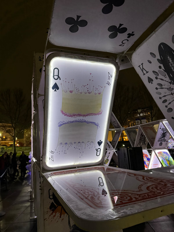
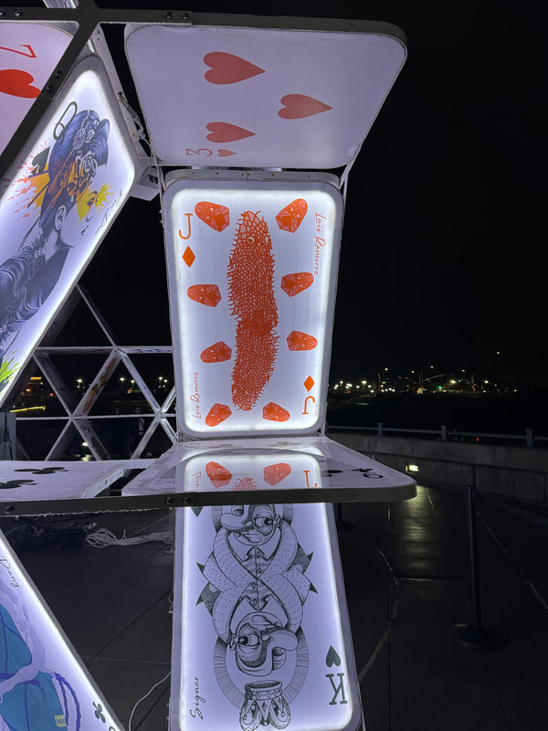
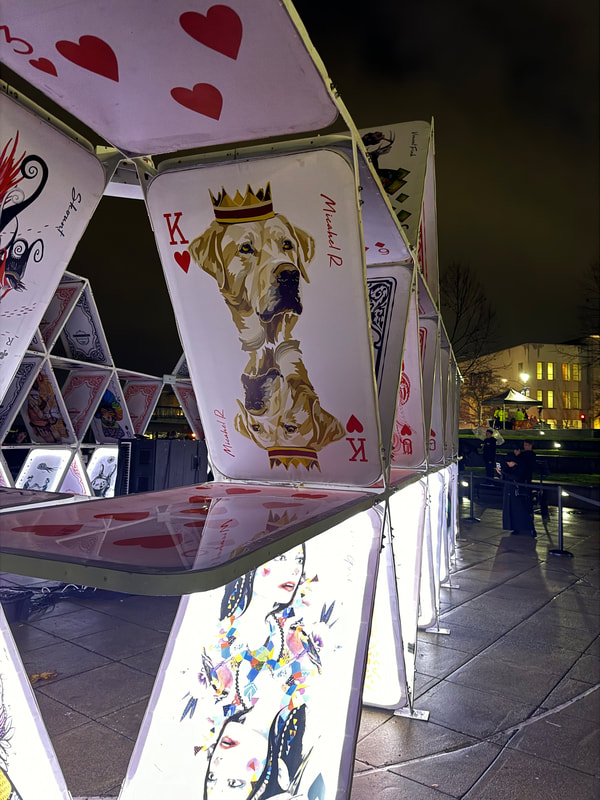
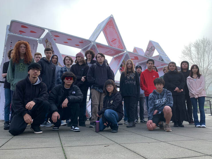
Background:The Napa Lighted Art Festival is a yearly event where Napa Parks and Rec sponsors a weeks long event downtown in the month of January or February. Anywhere from 2-3,000 people come to the downtown area to see light projections on the buildings, enjoy lighted art sculptures and participate in a community latern parade around the streets of Napa. It is a joyous and entertaining event for all ages and brings light into one of the darkest times of the year. An underlying purpose of the festival is to drive tourist business in the downtown area during the slow wine season in Napa. The Festival is in its fifth year and is going strong. 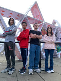 This year the Skills USA chapter at New Tech, in conjunction with the Digital Design Lab class, participated by collaborating with a lighted art sculpture group out of Israel, The OG Group. The House of Cards sculpture consists of larger than life cards stacked to make a card house. On each face there is room to include artwork from different artists from around the world. Our Skill USA chapter submitted designs to the OG group and Napa Parks and Rec. They chose four pieces to include in this year's House of Cards installation. Process: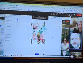 Our first steps involved meeting the folks from The OG Group via zoom to understand the parameters of the project. Students were asked to think about the concept of royalty and how that might influence what art they create. Card templates were provided for use in Adobe Illustrator and students were encouraged to use big, bold, bright colors that allowed the work to look engaging when lit up. During that first meeting, the Hamas/Israel war had just started and we were concerned about the safety of our collaborators in Israel. They said they welcomed doing this project as a way to "bring light" into a very dark time. It became a welcome distraction for our counterparts in Israel. We are so glad they decided to move forward with the project. Skills:Many of the students had already been certified in Adobe Illustrator from a previous Graphic Design class and so worked, quite independently on their designs. Technically, they had to make sure their files were the correct formats and sizes so that the final print on plexiglass would look best. Skills that students drew upon in this project include giving and getting feedback on their work at various stages of the design process, understanding and reading a request for proposal, asking clarifying questions of the OG Group, researching images appropriate for the audience, and executing their vision through the use of the tools in Illustrator, such as pen tool, shape builder, mirror function, pattern making, and color design. The piece premiered on Jan. 20th and the chapter took a walking field trip to the sculpture on Jan. 23rd to document the work. Seeing the scale of the peice and their work in action really impressed them. Many community members have been so impressed with this piece and we are so honored to have been included in the process. Via social media, folks from around the world are getting to view the work and see what our students are capable of! Next Steps:We have a wonderfully collaborative relationship with Napa Parks and Rec and have participated in this festival since its inception. We hope to have many years of collaboration in some form or another, with the artists and business people who create the lighted art festival. Perhaps next year we can do a building projection like we have in the past, or perhaps work with a local or international sculptor to create something new and wonderful! We have already met with one of the artists that lives right here in Napa and are scheming about future projects together.
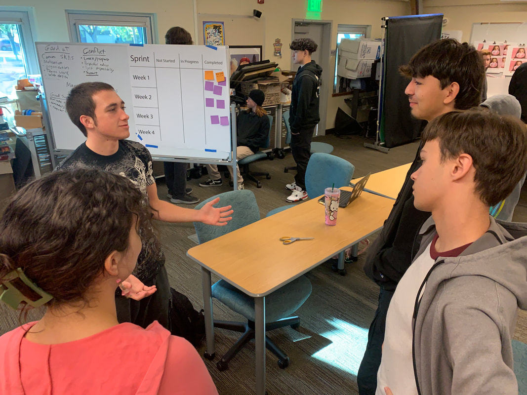
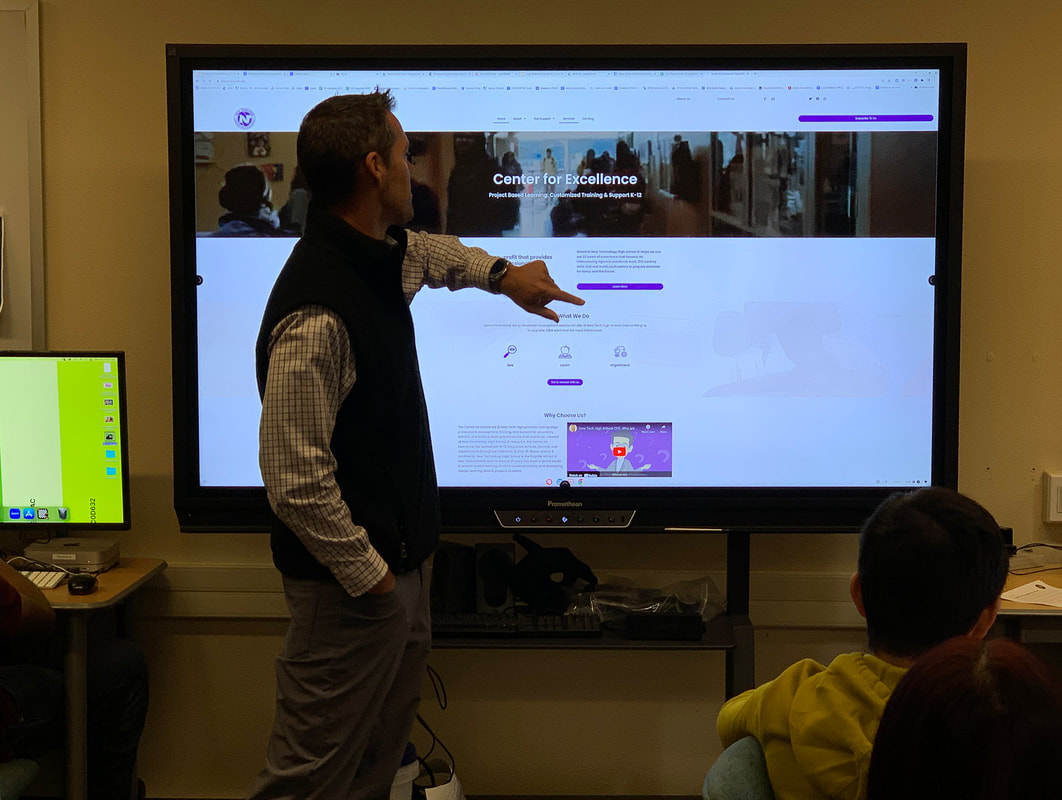
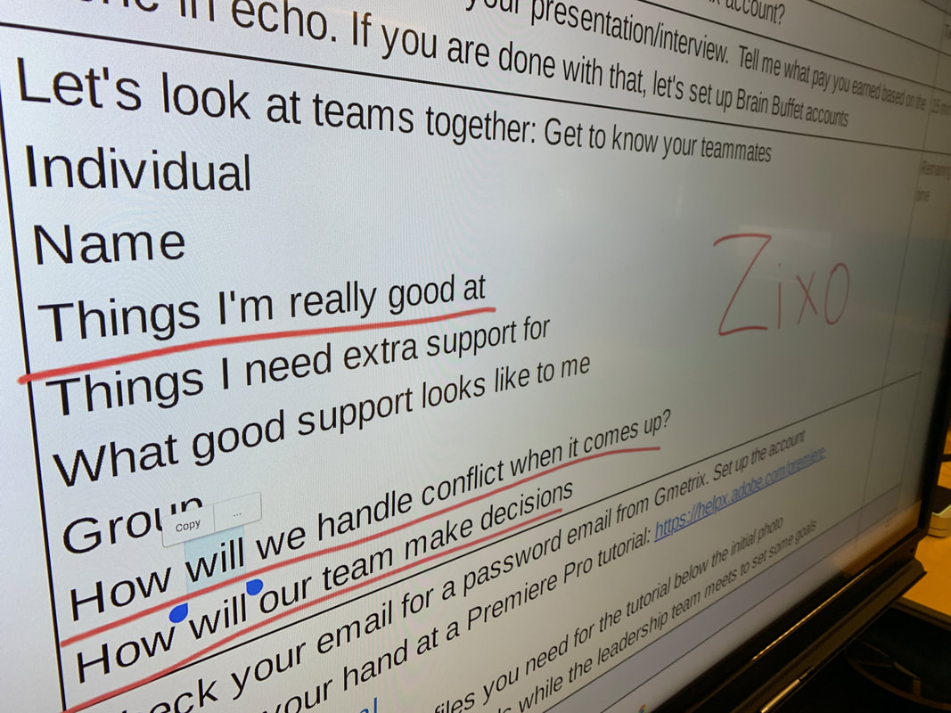
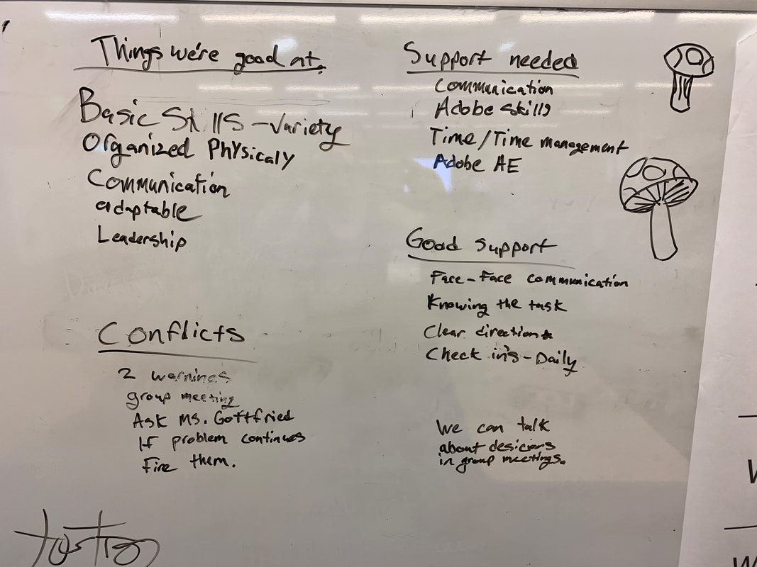
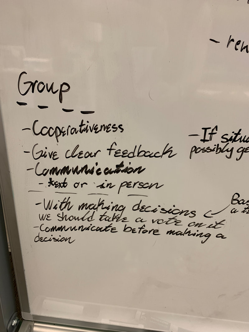
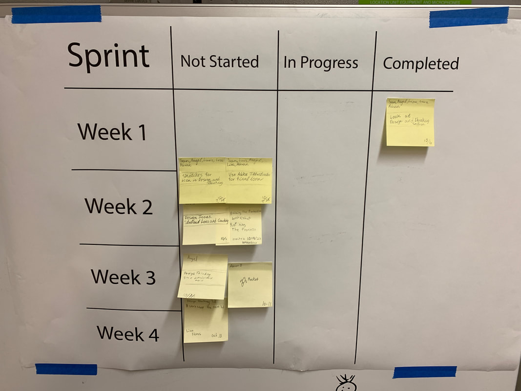
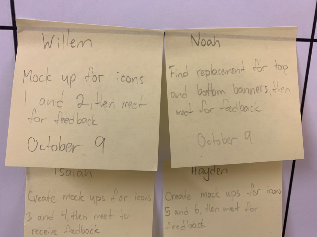
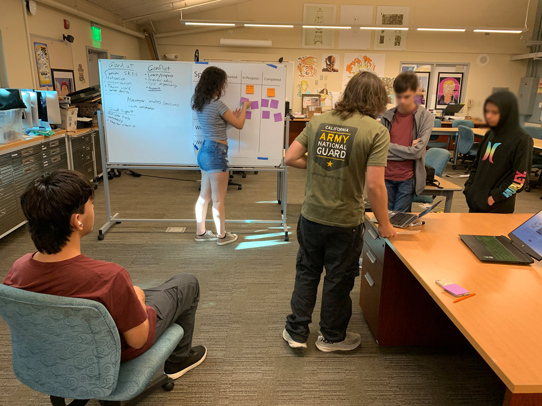
Background:We created a real design company called Zixo Designs that operates within the four walls of our high school and the students were off and running with our very first client of the school year. As the teacher, I wanted the students to be able to receive the money they earned at Zixo at the end of the year in the form of college scholarships. 2023-24 was the year to make that leap! One of our very first clients of the year was our very own on-campus Center for Excellence (CFE), a training facility that offers workshops about PBL and other cutting edge educational concepts to teachers and administrators from all over the country and the world. The trainings reach about 400 leaders and educators from 7 different countries every year including the U.S., Vietnam, Ireland, China, Israel and many others. In these trainings, educators often visit classrooms, speak to students and teachers on panels, and observe PBL in action. It's a win-win, in that students get the opportunity to speak with adults about what they are learning and practice their own leadership skills while our visitors get an in depth understanding of what PBL looks like on a practical level. Problem:The director of the program, Aaron Eisberg felt that the website used to promote the CFE's offerings could use a bit of design attention. He also had a strong desire to showcase student work throughout the website, because student-led learning and real-world projects are at the heart of what make PBL so effective. Mr. Eisberg came to speak with the students about what he needed, what budget he had available and a desire to know where the students felt they could improve the site. The designers started with analysis of the website, looking for places where visual clarity could be tightened up, places where more student representation via photos and videos might be warranted, and where the overall look of the website might be improved. Process:Students went through a resume-writing/interview/hiring process and were hired into specific roles on teams such as creative directors, sales people, PR and marketing, and junior, mid-level and senior level designers. Each team chose one portion of the website, analyzed what could be improved and then the team leaders synthesized all of that into a comprehensive proposal for the redo of the website. Before beginning to work in teams, each team member introduced themselves to their group and talked about what skills they already had and were good at, where they needed extra support and what that support might look like. They decided ahead of time what they would do when they encountered conflict and how their team would make decisions. Our Product Manager headed up the whole class and worked with team leaders to establish deadlines and expectations for each team. Because every team was working on a different part of the website doing different tasks, we used an Agile Project management tool called Sprint boards/meetings to keep track of tasks and who was working on them. Each team had their own sprint boards, decided their own tasks and deadlines and tracked their progress during stand-up meetings at the beginning of every class. As the teacher, I could look at a sprint board and see, very quickly, which teams or individuals needed extra support from me in form of 1:1 coaching, or a conversation with the team leader on how to work with an individual learner. This way of learning and coaching is a powerful way to teach, support, and troubleshoot collaboration skills in a way that allows for mistakes to be made and learned from. SolutionsWe planned a mid-project check in with Mr. Eisberg to show him the first iteration of the work for the website. There happened to be a study tour of teachers from Ireland here on campus that day, so they sat in on the meeting as well, as observers. Each team leader presented the work to the client while the Operations team took notes on the feedback Mrs. Eisberg gave. That document was then shared with the entire group and final changes were made to the website. Students created new icons for workshop offerings that provided clearer visuals for website visitors. They created more compelling video for the banner of each main page that showed students in action learning at New Tech. They used slow motion shots of entering the building with the students to create a more inviting sense of exploring the website. They updated the blog photos to better reflect the content and show more student faces instead of stock images. In addition, they provided a stockpile of photos for future blog posts so Mr. Eisberg could have enough images to keep a consistent visual look and feel. And lastly, they redesigned all the buttons on the site to be more uniform and round and friendly. We did have one students who acted as the webmaster and implemented those changes on the wordpress website for Mrs. Eisberg. The webmaster was responsible for following up with any team members who needed to make changes to their design assets based on the criteria the webmaster had chose. So, things like size of documents, file types, correct fonts and colors were all decided by the team leaders as a group, which they then communicated to their team members. The webmaster made sure that everything remained consistent for the overall look of the website In all of this, as the teacher, I remained the coach on the side. I had individual meetings with certain team leaders as needed to make sure that we presented a professional front. I did a lot of work with the Sales and Marketing team to make sure that the contract was correct, the emails to the client were professional and timely and that communications were clear and useful. The sales team learned about how to follow-up, when, where and how to request the funds to pay for the project, how to create invoices and more. In all of this, I insisted that the students do all of the communications with the client. "We presented the design team with a challenge of making sure that the icons on our website are authentic to the work we do here with students. Our goal was to celebrate their work and provide multiple revisions to get the work that we needed on our website. We are grateful for their efforts and they were great to work with, we are looking forward to next steps with the team!" -Aaron EisbergSuggested next steps for the client were made by the students. Some future projects might include creating social media content for future promotion of the CFE.
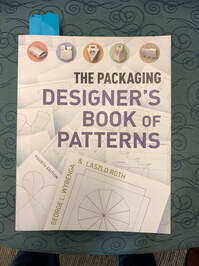
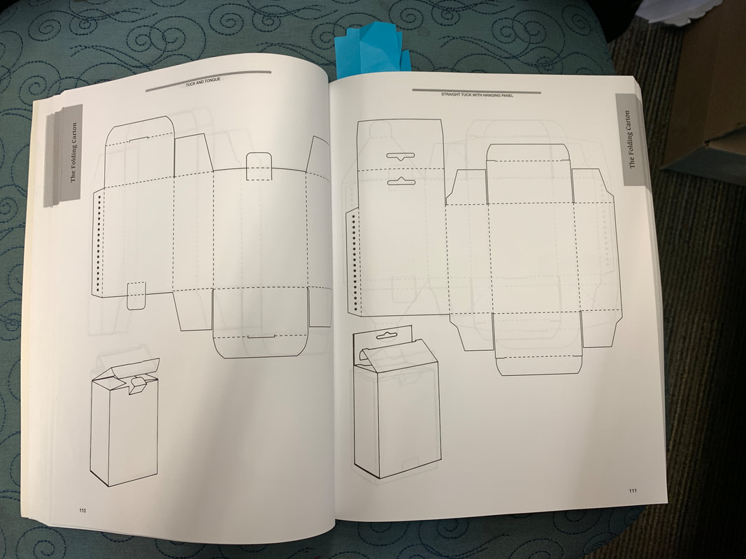
Zixo is excited to continue helping businesses to succeed online through powerful and clear visual communication. After our tiny packaging project (see below) our Graphic Design students moved on to a more hefty project making candy caddies that reflected the personality and traits they show the world (on the outside of the box) and the traits they tend to hold closer to their hearts (the candy pouches on the inside of the box.) A thank you to Jelly Belly for sharing their official die line for a candy caddy they actually use on the shelf, and another thank you to one of Jelly Belly's printers, PM Packaging who donated the specially die cut boxed to our school and to Vintage High's Graphic Design Class. Here at New Tech, thanks to a donation of piles of old Graphic Design Magazines, my students were able to cut and paste images from the bunch. It was a great way to expose students to great design, right at the beginning of the school year, without the kids even knowing that this was what they were doing as they leafed through the magazines, looking for images to use! We talked about use of color, design, and use of space. We also spent considerable time learning how to give and get effective feedback and reviewed how designers develop new packaging out in the real world. The final boxes were put on display during open house night and we hope to find a more public place to display the work in the near future. This project is a great example of how awesome it is to work with community partners like Jelly Belly and PM Packaging who spent considerable time this summer showing me and another Graphic Design teacher at Vintage how "the sausage is made." We had a chance to tour the printing plant, see all the presses, talk with everyone on the PM Packaging team. We spent the rest of the week meeting with the entire Creative Team at Jelly Belly from junior designers all the way up to the VP of Marketing. We learned about every aspect of package design, from the office to the manufacturing floor of Jelly Belly to see the designs in action. We took home many, many samples of packaging to show the students so that they could analyze what makes good packaging design. I came into the school year feeling confident that I could teach beginning packaging design and that my lesson was rooted in real world application. I loved sharing all my photos and experiences from the summer so that the students understood that what we were creating with our candy caddy project is exactly what designers do in industry when they are developing new packaging to bring product to the marketplace! What do you do at the beginning of the Graphic Design year when students may or may not yet have access to their new Adobe accounts? You jump into packaging on a tiny level. When I interned at Jelly Belly this summer with their Creative Team, one member showed me a wonderful book that included dielines, something used in industry to build cool packaging products. Inside the book are hundreds and hundreds of die lines or templates that can be used to build prototypes of different boxes and containers. The book comes with a link to download the files digitally so you can use the dielines as you wish. I bought some simple card stock that I ran through a regular desktop printer and chose 4-5 designs to print for the students.
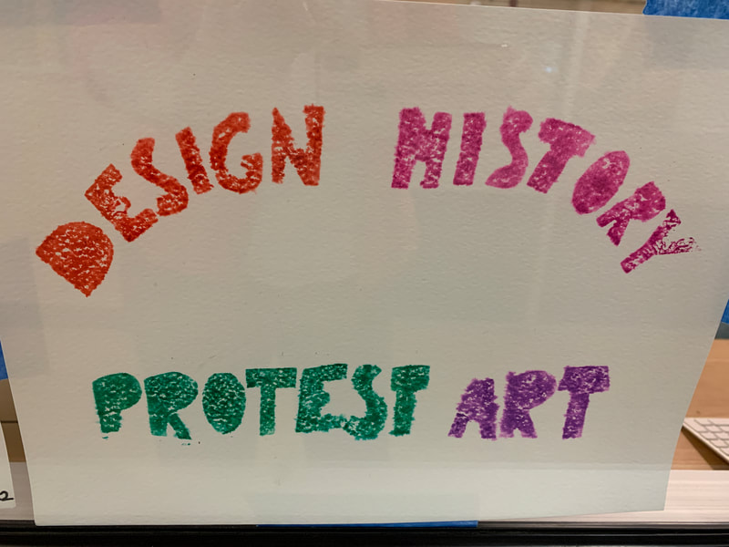
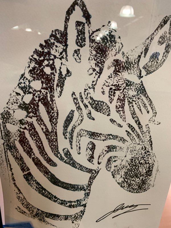
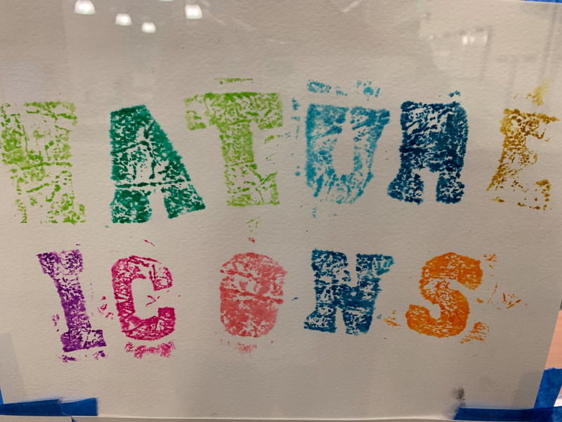
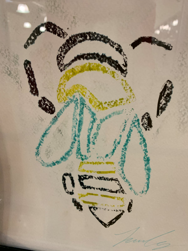
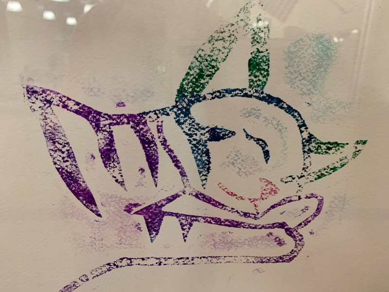
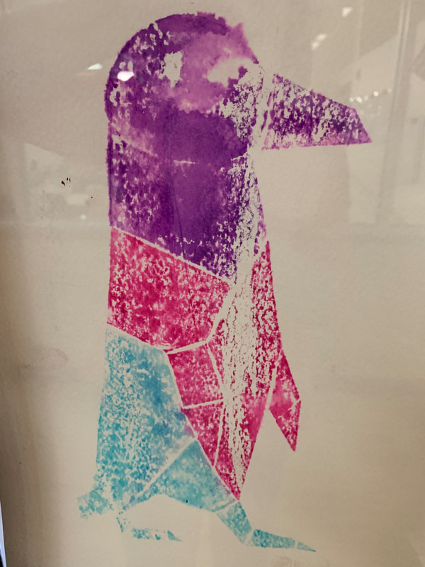
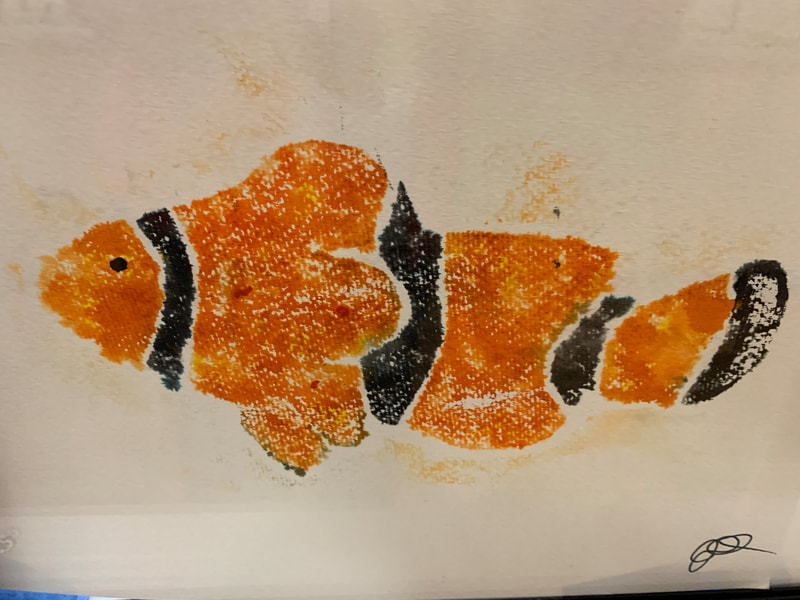
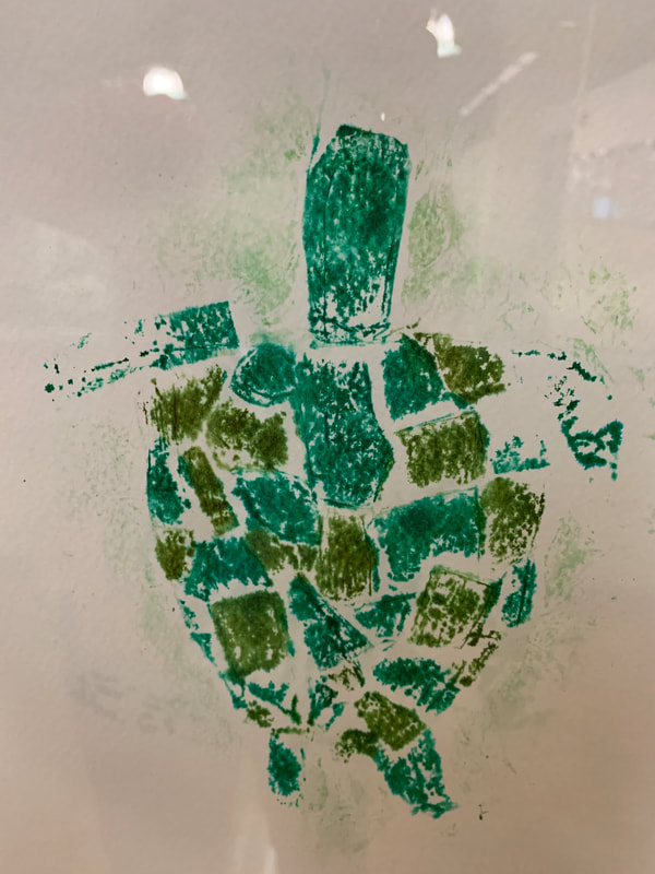
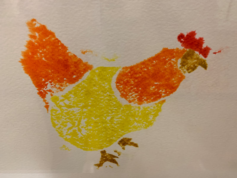
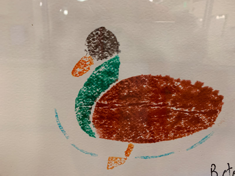
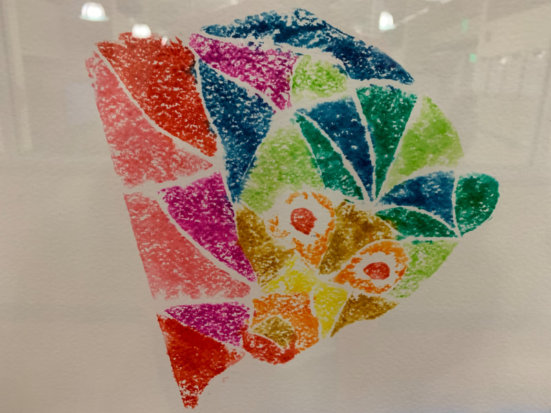
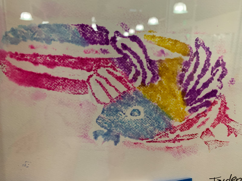
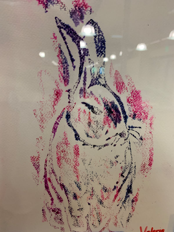
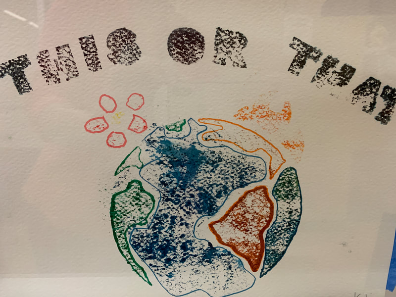
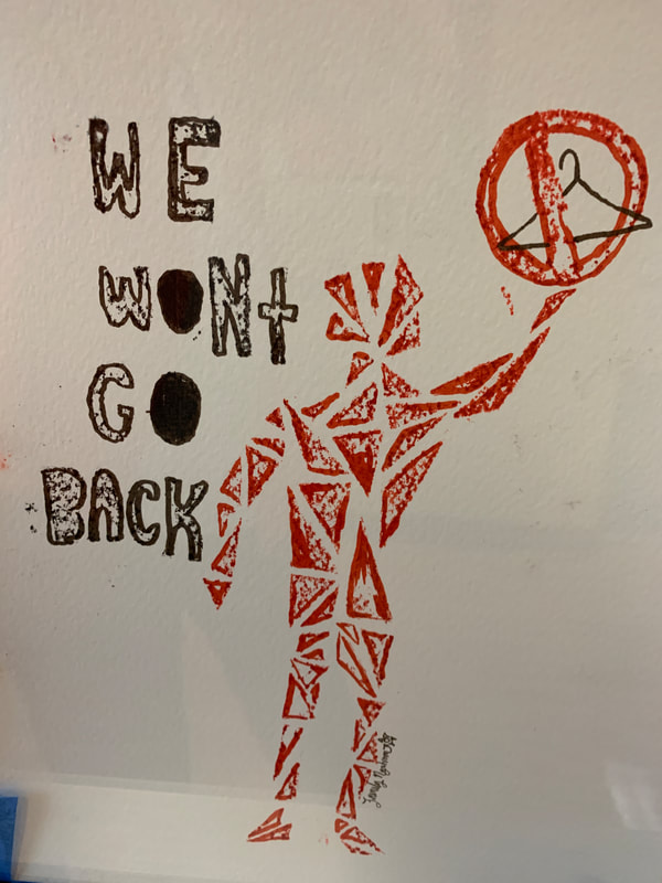
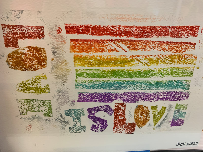
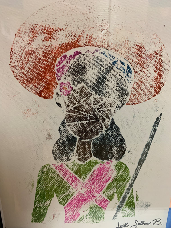
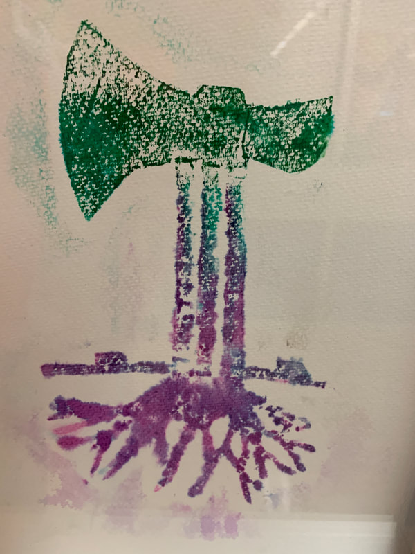
They were required to build the boxes and then design a package for a candy line called "Life is Sweet." I even gave them little tiny samples of Jelly Belly Beans to put in their boxes! I was a great hand-on project to begin the year and gave us a reason to talk about color, line, use of space and how it looks on the shelf. What a nice way to jump into design right away. This would also be a great smaller filler project for when a teacher needs something at the end of the semester or at the end of a project. I like that fact that it had students thinking about the nicer parts of life too. We started off the year in both Graphic Design and Advanced Digital Design Lab looking at shapes and lines using a watercolor print plate method. In Graphic Design students chose an animal or plant or natural object to represent who they are. Then then found reference images to trace or draw, looking at simplifying the animal or object to it's most simple of shapes, much like what we do in creating logos. Using cereal box cardboard and tinfoil, they made printing plates which then then applied water color pens. They then pressed water primed water color paper on the plate to showcase their designs.
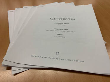
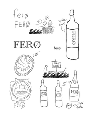
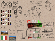
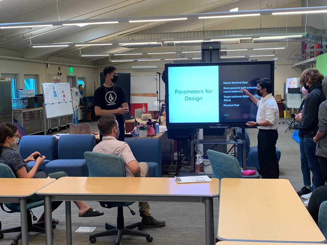
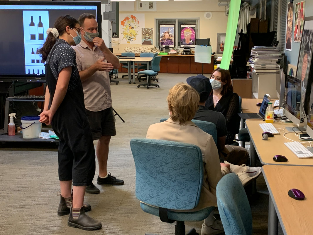
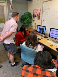
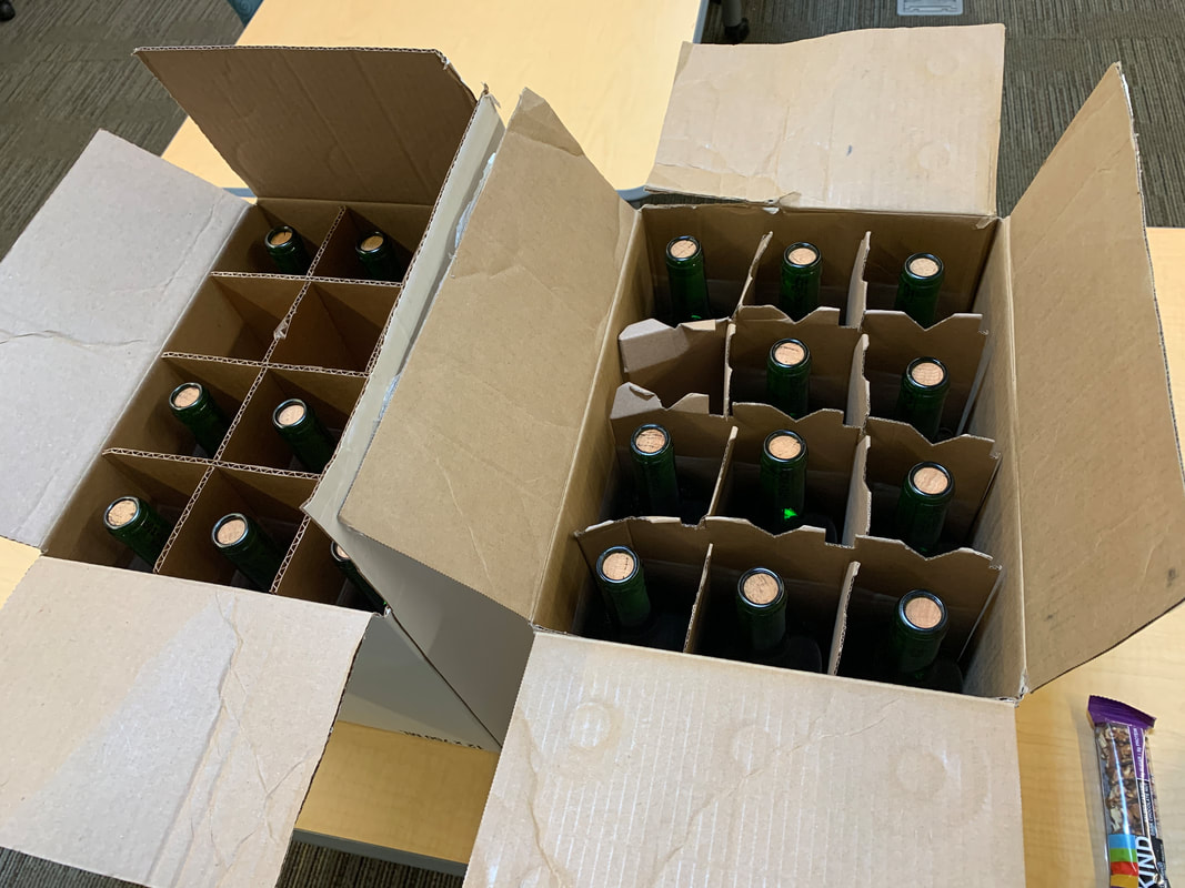
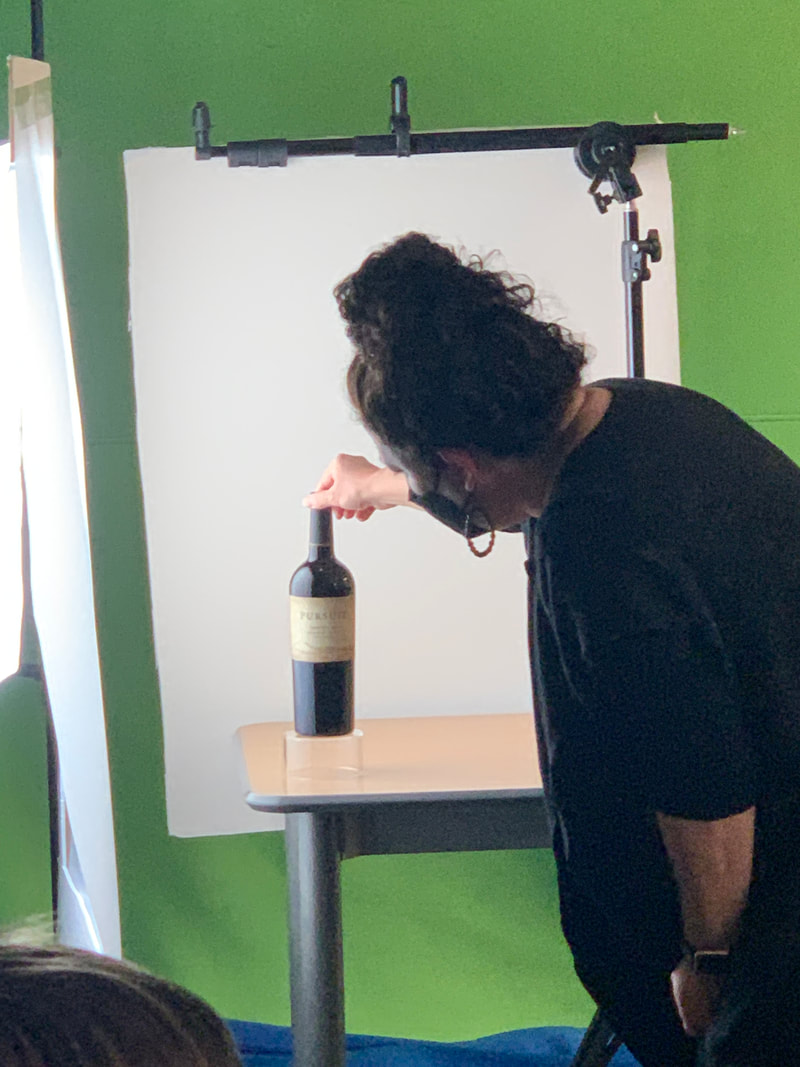
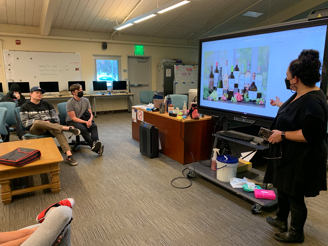
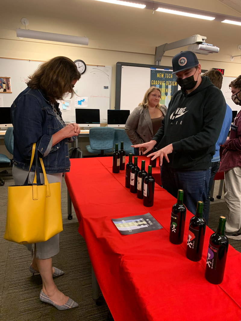
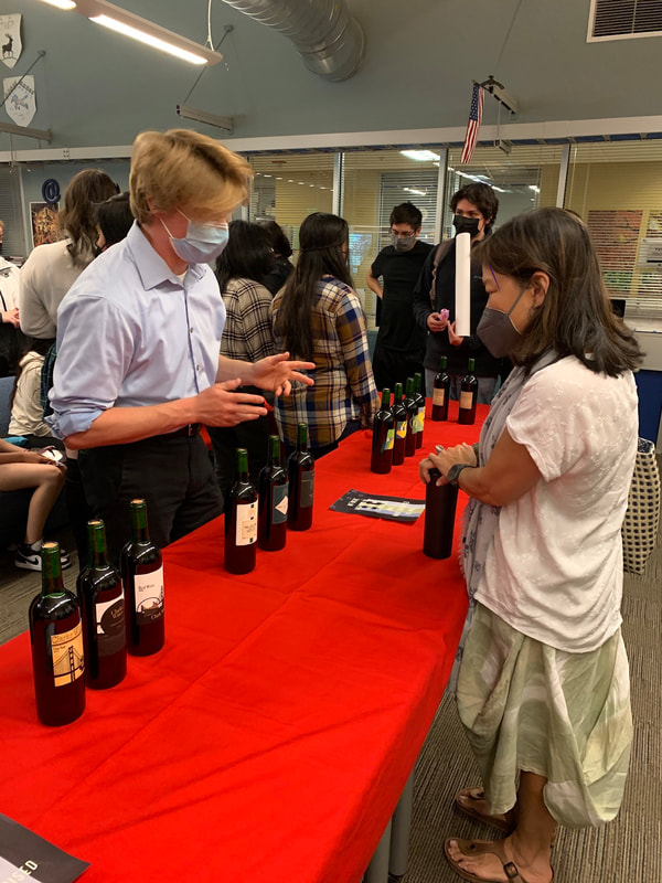
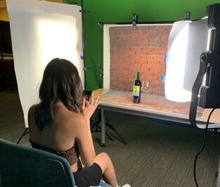
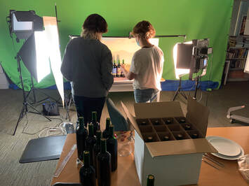
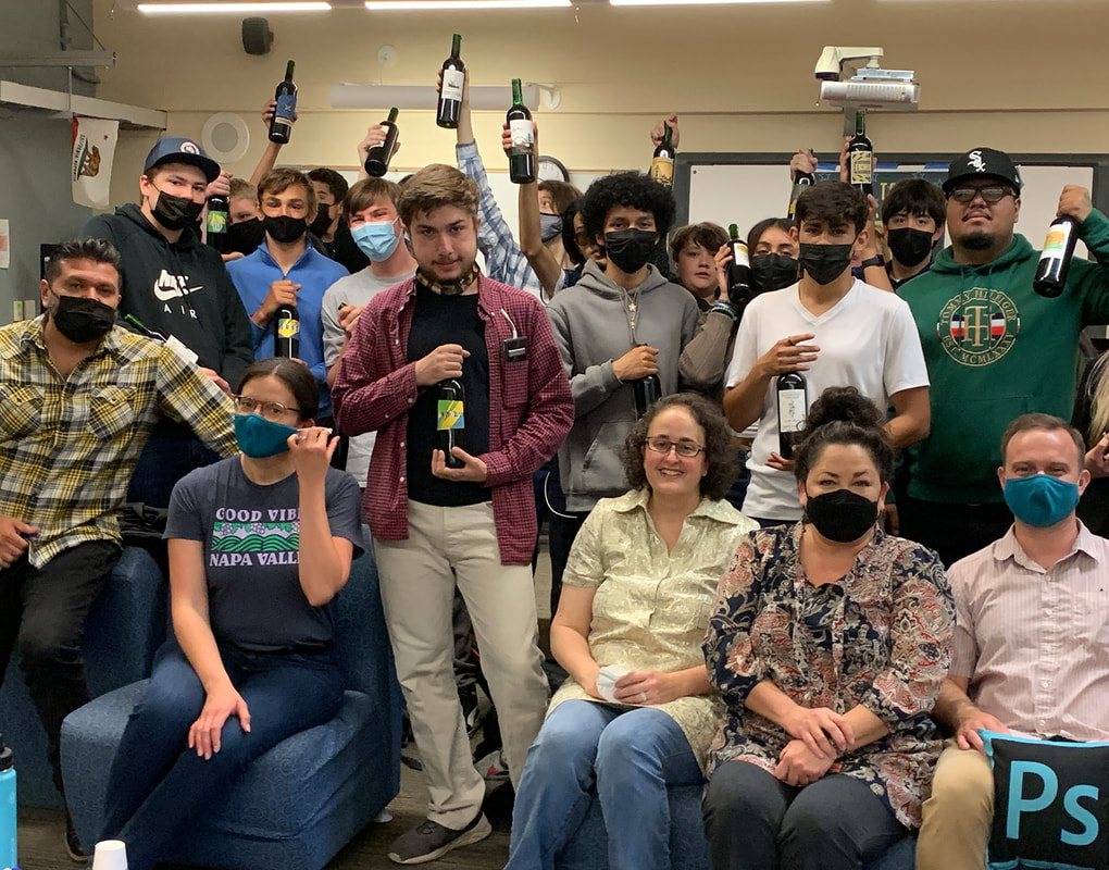
We used the same process in my Advance class, but instead explored the theme of protest art through history. Students then chose their own cause or social issue that they wanted to represent and designed a more advanced image to print in the same water color print plate process. Below are a few examples of student work. It was a great hands on way to start the year in Digital Design! The Project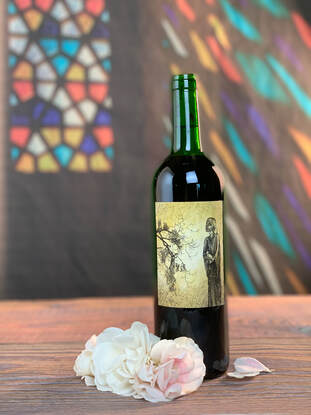 As a Design Teacher I've never done package design, but have always wanted to do a project with my Graphic Design students based on the concept. One of my advanced students had just finished his internship at a package design firm, Gatto Rivera and I was super intrigued about the process they use for designing, primarily, wine labels. Tim and Raquel Gatto, along with Antonio Rivera, agreed to meet with me to teach me what they did in a step-by-step overview. The meeting was intended for me to get some coaching and some information to take back to the students. When all was said and done, Tim, Raquel and Antonio agreed to go one step beyond and mentor the students through the process over a period of two months, meeting with the students every two to three weeks. Ideation: The Step That Needs More Time Than We ThinkWe began with ideation. The students were tasked with creating 15-20 very rough sketches to explore as many ideas as possible. Each team was given a creative brief of a "client" based on real clients but with their names and some details changed. Students were asked to design everything from a Brazilian wine maker in love with 80's punk to a generations old family winery based in the Sierra foothills. The briefs added a sense of realism and fun to the project, as the problems students were asked to solve were complex and challenging, just like in real life! After studying the briefs and doing further research online, students were then asked to communicate the problems they were trying to solve in each brief and then present the thumbnail sketches as possible solutions to those specific client problems. They then pitched their ideas to the Creative Directors at Gatto Rivera and got valuable feedback from them on how to further their ideas. Visual Cohesion Demands Team CommunicationThen it was time for implementation and further iteration, along with more feedback sessions from each other and from the Creative Directors. Here, we concentrated on making sure that the groups has some sort of visual cohesion between bottles, whether it be a shared brand mark, font or color palette. Bottles Make the Design RealOnce the labels were complete, they were sent off to the "printers" at Gatto Rivera, who very kindly managed to get bottles donated, filled them with colored, salted water, corked and then labels cut and applied. How amazing it was to see student work on the actual bottles! While we waited for the bottles to be made, we met with Stephanie Wolden from Wine Glass Marketing to learn how to take professional bottle and beauty shots. She was generous enough to donate the lights, camera and other equipment to ensure that we succeeded in photographing our bottles. Thank you, Stephanie! Industry Experts Attend our Wine Release PartyWe celebrated the finished product with a wine release party, just like industry does, but with grape juice instead of wine. Tim, Raquel and Anthony invited all of their contacts to come and give feedback and celebrate with the students. We had over 20 people from industry show up including the superintendent of Napa County, folks from Bay Grape, Fedrigoni, Jackson Family Wines, Offset, Solano Community College Digital Media Dept., Napa Valley Vintners, and Amorim Cork America. Having industry people interview the students about their process really upped the game and let them know that we take their work seriously. Adults said they were impressed with the student's speaking skills. One adult was surprised that the class was made up of mostly 10th grade students and is now seriously considering New Tech High School for their now 1st grader! We'll be waiting for you. As we bring the project to a close, the last and final steps include photographing the bottles and putting the pictures on their portfolios for future use. We are making full use of our large format printer to print both the backgrounds and the textures for the table. It's incredible what you can create with the right lighting, the right textures and a smart phone with portrait mode. We're Back with full PBL projects! Wahoo!For me, this project was a long-awaited return to PBL as I know it can be. We were able to involve community adults again in the classroom in a way that brings home the important lessons that PBL imparts, collaboration, speaking skills, writing skills and project management skills, all while holding the highest of standards for craftsmanship and precision in Digital Design. It's nice to know that PBL still really does work. It certainly has been sorely missed by me and by my students these last couple of years. But we are BACK and better than ever. It only took the entire school year to get here, but I am so relieved, and proud of my students for their excellent work! Mentors Make a Project Come AliveI've now done several projects with industry mentors that stay with the project from beginning to end, usually over several months, and I can not recommend it enough. Here are some of the most compelling the reasons to have a long-term mentor in the classroom:
I think the part about high school students being ready for meaningful work is the MOST important item on the list. Many of the behavioral issues we normally see in class disappear when we do a project like this. Students rise to the challenge, simply because it's an interesting challenge and the stakes are higher. It's is our imperative, as educators and community members to find ways for students of all ages to do more meaningful work. I once had a student say, "I don't do the work for the grade, I do the work because the community is counting on me." That's powerful stuff and this project delivered that impact. It's so good to be back! A big thank you to Gatto Rivera and all the industry folks who contributed to this project. If you'd like to see other impactful projects we've done in the past, check out our Lighted Art project, our Global Create-a-thon project and our museum exhibit project. Cheers! Mrs. Gottfried
Look! A simple photo of a basketball becomes a bouncing ball! The first lesson in After Affects to look at the squash and stretch animation concept.
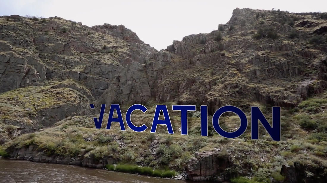
I attended a great 2 day training and learned all sorts of fabulous lessons in After Effects and Motion Graphics. Here's one below! I always love seeing these on TV shows, ads and movies. Now I know how to make it myself and will teaching my students this year! Click on the image below to play my "vacation" movie clip.
What an incredible group of Educators who teach Design around the world! I got the chance to tell my story of how I pivoted for Covid. I'm in awe of the folks in K12 and Higher Education. Yes, life has been hard, but there has also been some incredible moving forward in the education world. |
AuthorLisa Gottfried is a CTE teacher with 20 years experience as CEO of her own Video and Motion Graphics Production house. She currently teaches Digital Design at New Technology High School and at Touro University in the Masters of Innovative Learning program. She loves her job and her students! Archives
January 2024
Categories
All
|

 RSS Feed
